Redesigning Benefits for 12 Million Kaiser Members
Full case study coming soon
Introduction
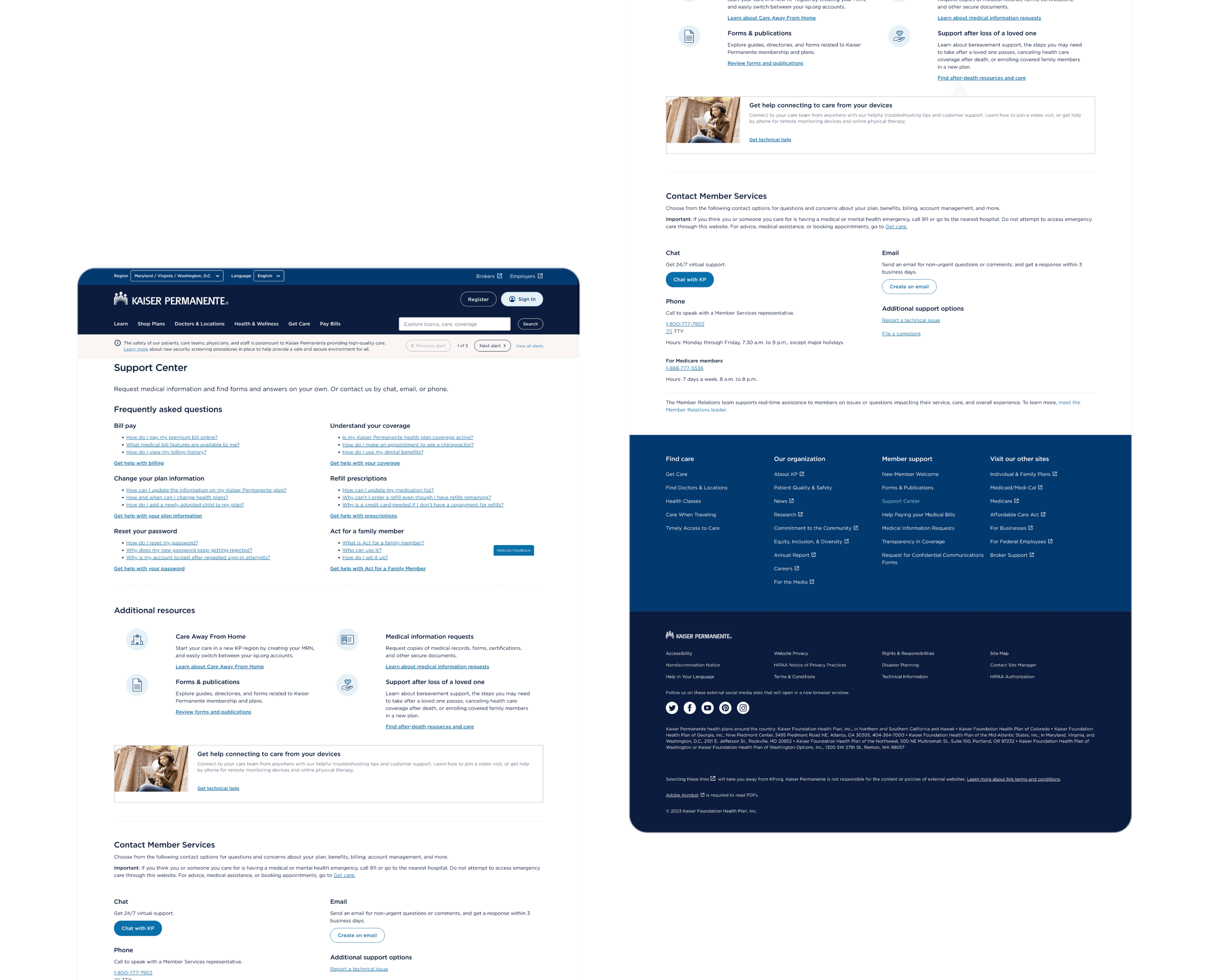
Kaiser’s legacy benefits portal wasn’t built to scale with its rapidly expanding benefit catalogue or plan structures. It was also confusing and hard to understand leading to a large number of member calls.
I spearheaded a systems‑driven redesign to understand costs and coverage—transforming fragmented touch‑points into a cohesive, future‑proof experience.
Complexity at a glance
Dual regulatory domains: healthcare + financial
Existing patterns that wHard to scale
Hundreds of plan configs across 6 regions and multiple business units
Outcomes
↑ 27 % task‑completion YoY (N = 20 k sessions)
6+ net‑new features shipped, including an interactive financial‑tracker that clarifies deductible, Out-of-pocket maximums and how they impact member costs.
North‑Star vision & roadmap adopted by senior leadership; now guides 3 upcoming releases
Role
Lead UX Designer
Team
2 designers; 1 content designer
Project Duration
14 months (ongoing)
Sector
Healthcare and Benefits (B2C)
Stakeholders
How we got there
Strategy & research
Systems mapping: modelled how benefits data originates, flows, and scales across regions to identify breakpoints.
Deep journey‑mapping: analyzed members’ care pathways & mental models across life stages
Design sprints, competitive analysis, and cross‑functional workshops drove alignment
Design execution
Scalable design solution covers 200 + plan permutations & supports future benefit types
Redesigned an in‑product financial tracker to educate members on real‑time spend vs. coverage (including over 60 different configurations)
Responsive, WCAG AA‑compliant flows shipped in lock‑step with Agile two‑week sprints